So, I was watching the Pixar documentary on Netflix the other day and I found it extremely interesting. At one point, they talk about how the computer was thought to ruin cartoons and animation for artists. People thought the computer would do all the work. Through out this "crisis" for animation artists, there was the group of technological experts that wanted to marry art and technology together. This group of people, eventually named Pixar, a break off of Lucas films, proves that art and technology can be put together and that it doesn't put out artists, it just is a different form of art. One of my favorite messages in the movie was about how these artists push the limits of the technology and then the technology improves to meet the art requirements. This is a super simple basis on what the documentary is about, though it is worth watching. While I was watching the movie, they showed a couple of the short films that they won awards for and that made me remember watching a few of the Birds short films and I decided to look up the most recent short film. The most recent came out with Toy Story 3 and is called "Day and Night". "Day and Night" is a touching story about Day and his opposite, Night, who show off all their differences and good qualities but end up forming a friendship and see that they arn't so different. From an art aspect, I really liked how it's a mix between old school looking animation and 3D animation. They were talking about how they never wanted to degrade 2D animation and this short film shows that they can mix together. The director of this Short Film is Teddy Newton who also earned an Oscar Nomination for it.
http://www.youtube.com/watch?v=VpN0vwgVBZk
http://www.pixar.com/shorts/d&n/anim_short_before_and_after.mov
Monday, April 25, 2011

Tuesday, April 19, 2011
Post 11- Frazetta
Frank Frazetta was a science fiction and fantasy artist who did the old Tarzan covers and some of the Conan covers. He just passed away last year May 10, 2010. Frazetta was the type of fantasy artist that was the inspiration for all sorts of up coming fantasy artists. This artist was all over the art scene for fantasy geeks like me. He's done comic series, paper backs, lord of the rings series, and his rep sheet goes on and on. From all of his artwork I would have to say my favorite piece is Chained Conan.


This piece starts with the contrast between Conan and the snake which leads to the change in proportion between the snake and Conan. The size of the snake catches your eye after the white of Conan's back. There is also a tension to the overall piece. Conan is straining against the chain and looks as if he is about to snap the chains and kick some reptilian butt. Beyond the contrast and the proportion and the tension, there is also a certain lay to the figures. It is set up in a pyramidal form that leads your eye to the top of the piece. The base of the pyramid are the two sets of chains which leads to Conan which leads to the giant snake towering above him. In the background is also many half formed devilish looking creatures that kind of hide in a formless smoke. This just adds to the dark scene. What I really like about this piece is that I connect it with an action scene from a book like Conan. You can tell a story about most every piece but this story connects with books I enjoy reading.
Monday, April 11, 2011
Post 10- Bert Monroy
Damen Train Station:


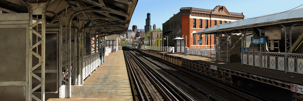
This piece was created by an artist named Bert Monroy. Bert Monroy works with digital paintings/creations. He started digital art in 1984 which makes him one of the first artists to embrace art at the digital computer level. He was even the co-author of the first Photoshop book and is in the Photoshop Hall of Fame. This piece, called Damen, is mostly all Photoshop, with some illustrator for a few symbols and words in the train station. This is the Damen Station in Chicago. The size of this piece is 40 inches by 120 inches. The file size is 1.7 gigs and the overall amount of Photoshop layers is 15,000. Now, this is an incredible size if you think about how about 400-600 songs will fit in 1.7 gigs and most Photoshop files have less than 50 layers (maybe approaching 100). What I find jaw dropping about this piece is it's depth. If you look at the overall piece, it is crisp and clear, but unlike other paintings, as you zoom in, the items in the piece don't get blurry, they just get bigger:
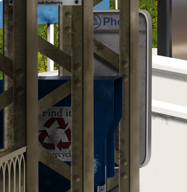
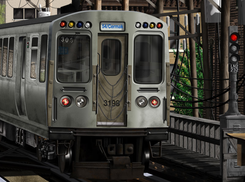
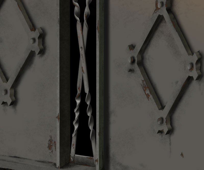
The overall piece is amazingly realistic with the train tracks receding into the distance. I chose this piece for a couple of reasons. First, I never saw this piece until recently in my Photoshop class and secondly because I can't stop staring at it. There is just so much detail in it that it is over the top amazing. I find myself thinking "I think I would go crazy if I did something like that." It really reminds me of how if this piece were on a huge billboard, you could stand far away and see the top post, then as you walk closer you see the detail. It seems like a lot of digital art misses that key, the sheer size effect.
Tuesday, April 5, 2011
Post 9- The Wood Dragon
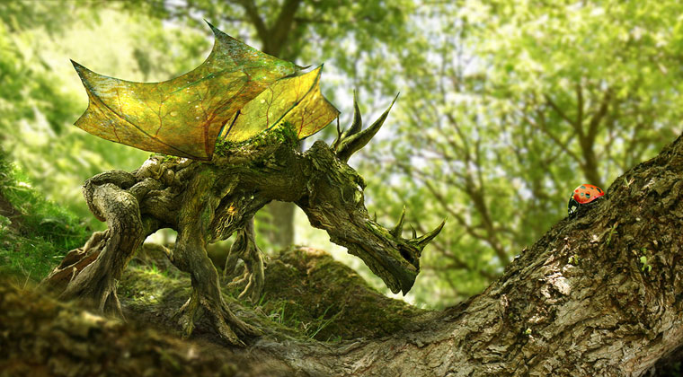
The Wood Dragon and The Ladybird:

This is another piece by Phil McDarby. Phil McDarby is a freelance graphic artist who started digital creations in 1998. Right now he lives in Dublin. I only mention where he lives because I imagine that the scenery around his home has inspired a lot of his digital paintings. Like, with The Wood Dragon, the characters are created with his Wacom Tablet and his background is created from his own photography. I love how in all of his pieces, he adds to the environment. He doesn't change it or make a whole new environment, he just adds to it. In this piece, there is a big element of design being used between the dragon and the ladybird, that being a line in line of sight. Line of sight and focal point. His focal point is created by contrasting colors of the ladybug and then the movement through the piece is back and forth between the dragon's eyes and the ladybug's eyes. I find this piece to be comical because it reminds me of an old west shoot out or a staring match. Either way this dragon is definitely intent on this little itty bitty ladybug. With his horns/antennas forward and his left leg lifted a little, I would say it's more curiosity towards the lady bug than malicious intent. Besides being comical, I would definitely label this as a cute picture of a dragon. Whenever McDarby does a fantasy work of art, he is able to add magic to a normal environment without ruining the environment. This dragon actually looks as if it plausibly fits in the environment.
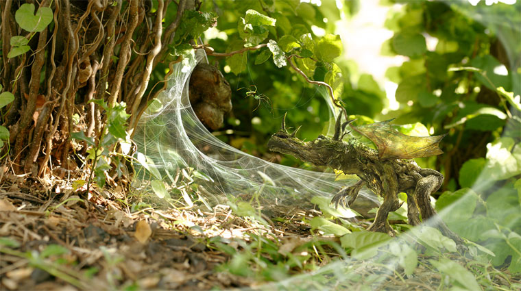
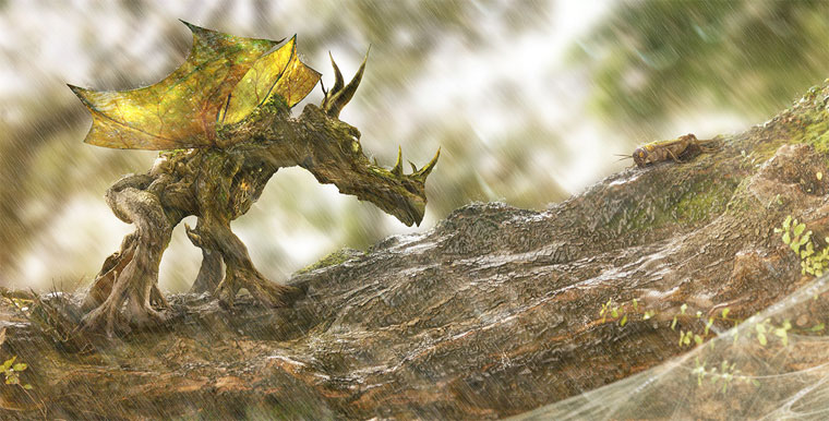
Here are some other wood dragons:


This is another piece by Phil McDarby. Phil McDarby is a freelance graphic artist who started digital creations in 1998. Right now he lives in Dublin. I only mention where he lives because I imagine that the scenery around his home has inspired a lot of his digital paintings. Like, with The Wood Dragon, the characters are created with his Wacom Tablet and his background is created from his own photography. I love how in all of his pieces, he adds to the environment. He doesn't change it or make a whole new environment, he just adds to it. In this piece, there is a big element of design being used between the dragon and the ladybird, that being a line in line of sight. Line of sight and focal point. His focal point is created by contrasting colors of the ladybug and then the movement through the piece is back and forth between the dragon's eyes and the ladybug's eyes. I find this piece to be comical because it reminds me of an old west shoot out or a staring match. Either way this dragon is definitely intent on this little itty bitty ladybug. With his horns/antennas forward and his left leg lifted a little, I would say it's more curiosity towards the lady bug than malicious intent. Besides being comical, I would definitely label this as a cute picture of a dragon. Whenever McDarby does a fantasy work of art, he is able to add magic to a normal environment without ruining the environment. This dragon actually looks as if it plausibly fits in the environment.
Here are some other wood dragons:
Monday, March 28, 2011
Post 8- Tomaselli

This is a piece (Expulsion) by Fred Tomaselli that is 84 x 120 inches. Fred Tomaselli seems to use a base technique for all of his pieces, usually combining a photo collage of images with paint and layered in resin. He had made other types of art, like his newspaper influenced pieces, but the majority of his work is photo collage and resin. This particular piece incorporates leaves, pills, insects, and acrylic. Technically, I didn't find this artist but his name was in a list of artists I could use in my compare and contrast essay for Art History. I didn't use this piece in that essay just so I could talk about it here in the blog. Everything seems to radiate out of that little vortex in the upper left hand corner of the piece. That vortex seems to be throwing out all sorts of debris like flowers, smiles, hands butterflies and even a couple of unidentified objects. The theme, though, seems to be that the vortex is shooting this stuff out as it shoots out Adam and Eve, or at least a man and a woman. All this goodness, smiles and butterflies, and flowers, seems to be lost to these two people getting expelled. The first thing I did when I saw this piece was say "Oh, hey this looks SUPER familiar." Of course that is because it IS super familiar. The figures walking away are almost identical to Masaccio's Expulsion of Adam and Eve which we looked at in Art History. What I like about how Tomaselli did his figures was that they were stripped of their flesh. That, to me, is almost making them more human. By comparing these two pieces, you can see that the angel in Massacio's piece is probably the vortex of goodness in Tomaselli's piece. I find it amazing that current artists can look back to earlier art, make their own interpretation of it, and then create such a beautiful unique piece of art.

Tuesday, March 15, 2011
Post 7-Arrested Developement
(Link to Video Clip)
http://www.hulu.com/watch/1340/arrested-development-christmas-pageant-mayhem

This is from the show Arrested Development. I heard people talking about this scene in Art History so I had to go look it up. Of course, it turns out Arrested Development is all over Netflix so I was also able to get hooked on the show. This show was created by Mitchell Hurwitz. The whole idea of the art in the episode is that they take famous pieces of art and incorporate live models in them for a Christmas pageant. This will directly lead to hilarity but this also shows art in the modern world. Michelangelo's "The Creation of Adam" is used with George-Micheal and the Dad. This is something that was created over 500 years ago and is still being used in modern types of art like media. When George-Micheal is in the piece, he is wearing shorts instead of being nude and the Dad who is playing God ends up getting tazed when he tries to escape. This is also used in an episode of the Simpsons.
 It just shows that art from the past does influence our world and this is just one tiny example.
http://www.hulu.com/watch/1340/arrested-development-christmas-pageant-mayhem

This is from the show Arrested Development. I heard people talking about this scene in Art History so I had to go look it up. Of course, it turns out Arrested Development is all over Netflix so I was also able to get hooked on the show. This show was created by Mitchell Hurwitz. The whole idea of the art in the episode is that they take famous pieces of art and incorporate live models in them for a Christmas pageant. This will directly lead to hilarity but this also shows art in the modern world. Michelangelo's "The Creation of Adam" is used with George-Micheal and the Dad. This is something that was created over 500 years ago and is still being used in modern types of art like media. When George-Micheal is in the piece, he is wearing shorts instead of being nude and the Dad who is playing God ends up getting tazed when he tries to escape. This is also used in an episode of the Simpsons.

Sunday, March 6, 2011
Post 6- Gloaming Born

This is called The Gloaming Born by Phil McDarby. Phil McDarby is a freelance digital artist who has been using digital methods since 1998. The majority of his art is an attempt to create a sense of wonder and magic in the piece. This was created in photoshop using over 200 layers and was designed as a mural for his daughter. Some elements and principles of design being used are balance, emphasis, and unity. The balance of this piece is created with the tree character on the right and the deer and creek on the left. The tree character is the focal point of the piece by how the lighting and colors are all more vibrant on the character/miniature baby tree. This creates an emphasis on that area. Every where else it is misty and a little fuzzed out but is perfectly bright and clear on the tree character. All of this piece looks like it belongs in a forest, creating a unity. Even with a tree coming to life, it looks as if it fits with the environment. I found this artist through Google Images, looking for a landscape to use in photoshop and when I found this I thought it had just been a plain old forest. This was looking at the image through a little 2 inch pop up so when I clicked on it to get it full size I was glad to find that it was no average forest. The tree character looks so serene as it creates this little baby tree. Even one of the deer seems to be looking at what is happening from the background. It's one of those scenes in nature that you would be privileged to watch (of course you couldn't watch this but it's one of those types of scenes). It's very calming with the babbling creek and soft lighting that you can just chill out as you enjoy looking at it.
Subscribe to:
Posts (Atom)